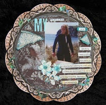
for southern girls challenge
I loved doing this page,its pretty
sparse for me but i like the
white space with this photo. Its hard
to get a photo before the light gos these
days,so its not great
Scrapbooking and altered art


Posted by Carol at 17:32 7 comments
 close up of cutting
 This layout was one of Nic Howard's classes
Posted by Carol at 12:06 2 comments
 I had the best weekend iv had for a very long time. The classes were great,the venue Divine,in the photo above there is a large warm swimming pool and deck lots of lovely walks through the park like grounds. We ate to much scraped lots and just had a fabulous time. Cherie and i were roomies for the weekend and we had lots of laughs,just looking through the photos lol hmm some i think might have to stay for our eyes only be back soon to update the blog
 Posted by Carol at 19:51 4 comments
 Its that time again. This month at Birds of a feather
Posted by Carol at 14:03 1 comments
